SHORTCOMINGS THAT CAME ALONG
THE WAY
-
Balancing modern design aesthetics with the existing content was challenging to maintain brand consistency.
-
Ensuring smooth transitions between interactive elements like hover-activated videos without compromising load times.
-
Adapting the previous information architecture to a more intuitive flow while preserving all key sections.
-
Managing the toggle between light and dark modes without creating design inconsistencies.


Image Gravure
Timeframe
2 weeks
Roles
New user flow
New Information Architecture
Redesigning of the whole website
Link
Launching Soon
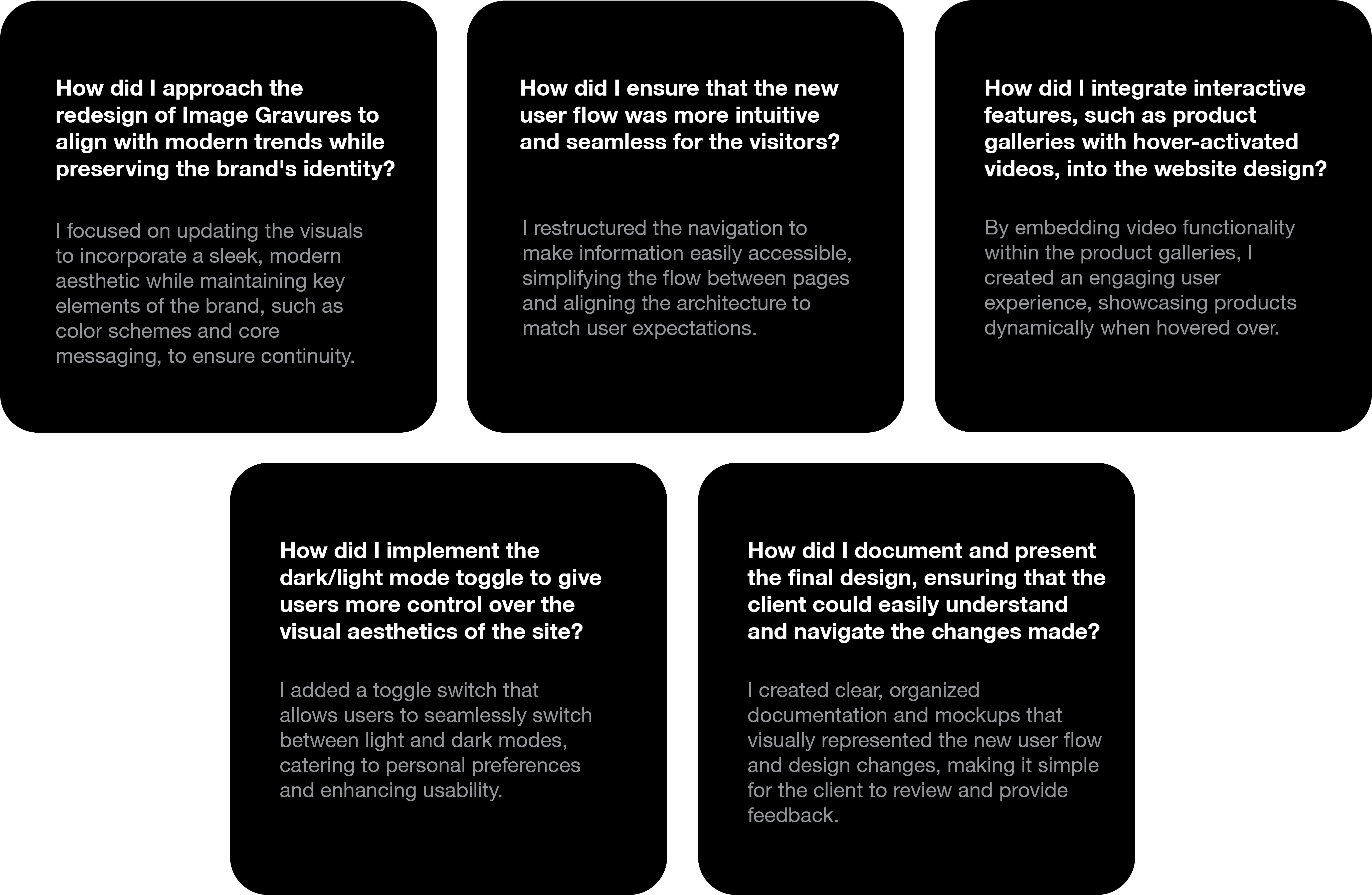
For the redesign of the Image Gravures website, I received all necessary resources, including the site map, content, images, and videos from the previous site. My task was to create a completely new interface, focusing on modernizing the design and enhancing usability while preserving core content. This approach ensured a smooth transition with an improved user experience, while maintaining the company's branding and message.

Why did I use the Bento Box layout?
The Bento Box layout helps organize content efficiently, allowing users to access multiple elements in a compact and visually appealing way, improving product presentation.
Why did I maintain the brand’s identity with modern design?
It ensures that while the site feels fresh and updated, it still aligns with the brand's core values and messaging, building familiarity and trust with users.
Why did the previous design lack engagement, and how can I avoid similar issues?
The previous design lacked engagement due to its outdated aesthetics and basic layout. To avoid this, I incorporated modern design trends, dynamic features like hover-activated content, and user-friendly navigation to enhance the browsing experience.
THE RIDDLE OF WHY


BUILDING THE
BLUEPRINT


ROBOTO
MONO
Aa
ABCDEFGHIJKLMNOPQRSTUVWXYZabcdefghijklmnopqrstuvwxyz0123456789
Regular
Medium
Bold
COMPONENT
LIBRARY


The Design Language

White
#FFFFFF

#000000
Black

LOOPHOLES
IN THE
PREVIOUS
DESIGN
-
Outdated Design: The overall layout was old-fashioned and did not reflect modern web design trends.
-
Lack of Engagement: Minimal interactive elements like hover effects or animations to keep users engaged.
-
Poor User Experience: Navigation was not intuitive, making it hard for users to find key information easily.
-
Misalignment with Brand Identity: The design did not match the company’s vibe or industry standards, resulting in a disconnect between the brand and its online presence.


PROTOTYPING
THE
VISION
The wireframes I created served as a blueprint for the website's design, helping visualize the layout and structure of each page. They prioritized user experience by focusing on navigation, content placement, and interactive features, enabling clear communication of my design intentions to stakeholders. Additionally, the wireframes provided a foundation for further refinement, facilitating iterations before moving into high-fidelity mockups. Overall, they were essential in translating conceptual ideas into a functional and user-friendly interface.


Finding Refrences
In creating the redesigned Image Gravures website, I drew on a variety of references to ensure a modern, user-friendly design. I utilized resources from the existing website, such as the site map, images, and videos, while also incorporating Bento Box layouts, a design approach that organizes content into clean, modular sections. This allowed for a more structured and visually appealing presentation of products. Additionally, I referenced UX design principles to improve usability, integrated dynamic features like hover-activated videos, and added a dark/light mode switch for user customization, all while maintaining the brand’s identity.


Next Project

THE RUSH HOUR
I worked quickly on several key areas during the website redesign. Creating wireframes allowed me to establish layout and structure efficiently. Mapping the user flow visualized navigation paths without getting bogged down in details. Utilizing existing content from the previous site streamlined my efforts, while incorporating provided images and videos facilitated swift design decisions. Implementing the light/dark mode toggle leveraged existing patterns to enhance user experience, and integrating feedback during revisions ensured the design met client expectations promptly.

WHEN THE
PRESSURE PEAKED
During the website redesign, I faced moments of panic in several areas. Tight deadlines heightened my anxiety about completing tasks on time, while unexpected client feedback required significant adjustments to my design. Technical challenges, particularly with implementing the light/dark mode toggle, added frustration as I rushed to troubleshoot. Additionally, initial user testing revealed usability concerns I hadn't anticipated, raising worries about the project's overall effectiveness. Balancing modern design elements with the brand's established identity further contributed to my stress, as I aimed to innovate without losing the essence of the brand.


