Poojan Decor
Timeframe
1 week and 3 days
Roles
New user flow
New Information Architecture
Redesigning of the whole website
Link
Launching Soon
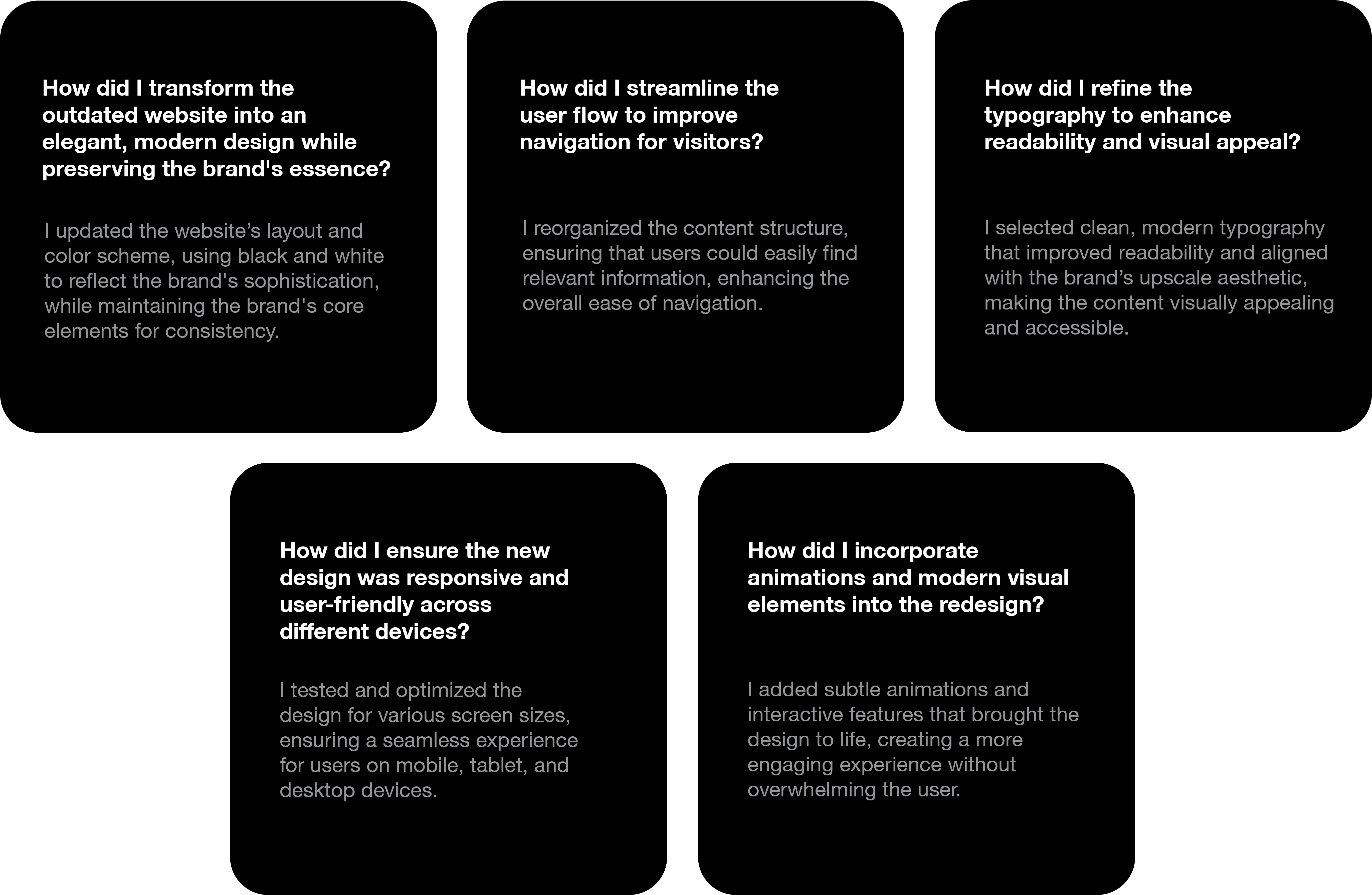
The project involved transforming the existing Poojan Decor website into an elegant and aesthetically pleasing online presence. The goal was to create a design that not only reflects the brand’s sophistication but also enhances the user experience through a visually appealing and intuitive interface. The redesign should focus on clean layouts, refined color schemes, and carefully selected typography, all aimed at presenting Poojan Decor’s offerings in a way that is both modern and timeless.


Finding Refrences
For the Poojan Decor website redesign, I drew from various references to guide my design decisions. I conducted a competitor analysis to identify industry trends and user preferences, while UI principles informed my approach to navigation and user engagement. Color theory helped me select a refined palette that reflects the brand's elegance, and typography guidelines ensured font choices aligned with sophistication and readability. Additionally, I found inspiration in modern websites known for their clean layouts and effective visuals, shaping a user-centric design that enhances the online experience for Poojan Decor's clientele.


THE RIDDLE OF WHY
Why does the current design fail to engage users effectively?
The existing design lacks interactivity and visual appeal, leading to user disengagement.
Why are users leaving the website without taking action?
Ineffective calls to action and a lack of compelling content result in a higher bounce rate.
Why isn't the brand's identity reflected in the design?
The outdated aesthetic fails to capture the elegance and sophistication of Poojan Decor's offerings.


MAPPING THE MAZE


BUILDING THE BLUEPRINT


The Design Language

DM SERIF
DISPLAY
Aa
ABCDEFGHIJKLMNOPQRSTUVWXYZabcdefghijklmnopqrstuvwxyz0123456789

ABCDEFGHIJKLMNOPQRSTUVWXYZabcdefghijklmnopqrstuvwxyz0123456789
Aa
JOST
Regular
Bold

White
#FFFFFF

#000000
Black
COLOR
THEORY
Black and white was used in the Poojan Decor website to create an elegant and timeless aesthetic that aligns with the brand's sophistication. This color scheme allows for a clean layout that highlights the visual elements of the site, ensuring the offerings are presented in a refined manner while enhancing the overall user experience.


LOOPHOLES
IN THE PREVIOUS DESIGN
-
Outdated and basic layout that lacked modern appeal.
-
Poor alignment with the brand's sophisticated image and vibe.
-
Inefficient user experience, causing difficulty in navigation.

PROTOTYPING
THE
VISION
The wireframes I created served as a blueprint for the website's design, helping visualize the layout and structure of each page. They prioritized user experience by focusing on navigation, content placement, and interactive features, enabling clear communication of my design intentions to stakeholders. Additionally, the wireframes provided a foundation for further refinement, facilitating iterations before moving into high-fidelity mockups. Overall, they were essential in translating conceptual ideas into a functional and user-friendly interface.


SHORTCOMINS
ALONG
THE WAY
-
Limited time to fully explore creative ideas.
-
Difficulty balancing brand sophistication with modern design elements.
-
Challenges in incorporating engaging animations without overcomplicating the interface.
-
Ensuring smooth transitions between the dark and light themes while maintaining usability.


THE RUSH HOUR
The part where I worked very fast in the Poojan Decor project was in creating the overall layout and structure of the website. With a clear vision of the modern and elegant design, I quickly implemented clean layouts and refined color schemes, ensuring the interface aligned with the brand's sophisticated aesthetic. This allowed for a smooth and efficient design process, particularly in establishing the foundation of the new look and feel.


WHEN
THE PRESSURE
PEAKED
The part where I panicked during the Poojan Decor project was when I had to ensure the animations and interactive elements matched the brand's elegant tone. There was a concern about finding the right balance between sophistication and user engagement without making the website too flashy or overwhelming. This moment of uncertainty slowed down my progress as I wanted to avoid overcomplicating the design while still delivering a modern and interactive experience.
